The Oceans, Their Complexity and Their Major Role in Earth’s Climate
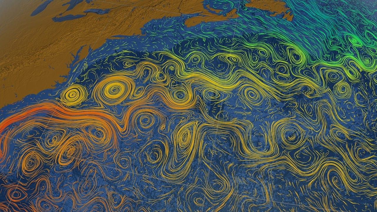
The first image here is not a bowl of spaghetti though it may perhaps look like one. They are not Ramon noodles nor elbow macaroni either. If one looks closely, the east coast of North America is visible in the upper left-hand portion, with the North Atlantic Ocean to the right. Here we notice lots of circles, eddies and lines all across the ocean surface. These lines and shades of color show different water temperatures, and they are all higher than normal.
The image, published in “Live Science” on 10/25/24 is courtesy of the NASA/Goddard Space Flight Center Scientific Visualization Studio.
Looking closely at this image one can see Florida [ bottom left] and a current of warm water flowing around it and along the coast of eastern North America. [NOTE: This 100 degree water is where the two recent Hurricanes Helene and Milton that pummeled Florida derived most of their energy from.]
This is the Gulf Stream, and the shades of oranges and reds indicate warmer water temperatures. This stream of warm water continues along the coast to Canada, Nova Scotia, on to Newfoundland, and beyond, in the upper right of this image.

And this energy, this warmth keeps moving. London is at 51 degrees north latitude and NYC at about 41 degrees. With each degree of latitude equaling almost 70 miles, London is about 700 miles north of NYC yet its climate is considerably milder. Without all this heat coming with the Gulf Stream, London and Northern Europe would be much colder and a very different place.
One thing we must remember is that oceans cover about 70% of Earth’s surface. Another is that the average depth is about 10,000 feet or 2 miles. That is an enormous amount of water. It should be noted that in the western Pacific Oceanthere is a place called the Challenger Deep where the depth reaches almost 36,000 feet [almost 7 miles].
So, what does this all mean? Basically, all this water is a fantastic heat sink. Any of us who has heated a pot of water during cooking knows how a “watched pot never boils.” It takes a lot of heat to make a cup of tea.
The oceans have absorbed more than 90% of the extra heat captured by Earth’s atmosphere due to our carbon dioxide emissions. Several other top greenhouse gases [GHG] include methane, nitrous oxide, fluorinated gases [refrigerants] and water vapor.
What we must remember is that we, all of us, burn, combust, and consume the equivalent of over 100,000,000 [100 million] barrels of oil per day. Yes, every day. 365 days per year. Year after year. This adds up to almost 40,000,000,000 [40 billion] tons of CO2 equivalent every year emitted into Earths’ atmosphere.

A second image, from the same source as the first, shows a smaller portion of the North American coast to the upper left, but more of the Atlantic Ocean. It is included here as the circles, eddies, motions of the sea surface and temperatures, all different from the first image, are almost a Rorschach test. Or perhaps, the circles are a reminder of the 1893 painting by Edvard Munch “The Scream.”
And to scream about what is happening to Earth’s ecosystems, weather and climate, is not inappropriate.
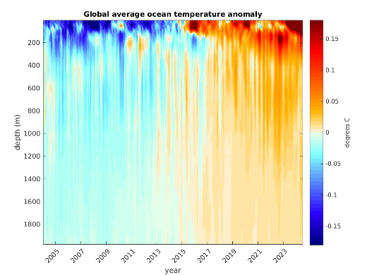
The next image in this discussion is titled “Global average ocean temperature anomaly.” It is loaded with information so please be patient as we go through the data.

The horizontal axis along the bottom is “year” from 2003 to 2023. The vertical axis on the left is “depth” in meters [ 3.1 feet per meter] and the vertical axis bar on the right is in units of temperature [degrees C]. It is detached from the chart and gives a definition of the temperature associated with the color. The information here is part of a multi-national project using thousands of ARGO floats in all our oceans giving us this more complete “picture” of water temperatures to depth for the first time.
Moving from left to right in this image we can see that the “blue” color is the dominant color near the surface, two decades ago, with cooler ocean temperatures and some limited information on water temperature down to about 800 meters [about 2500 feet.]
Moving further to the right over the more recent years we see a color shift to yellow, orange and red as an indicator that the ocean waters have warmed, down to over 1800 meters [about 5,600 feet]. What this means is that even though Earth’s atmospheric temperatures, month after month, have set records in the last few years, all that water in the oceans has absorbed most of this trapped heat or energy.
If the oceans had not absorbed almost all the energy trapped by our GHG emissions, we would have “fried.” It takes a lot less energy to heat air as opposed to water.
There are other implications here with these changes in the Gulf Stream: its’ movement north along the coast appears to be slowing down, and water brought west across the Atlantic by the trade winds will begin to pile up on the east coast, contributing to rising sea levels more than they are already. This research isongoing, and we can expect more definitive implications and results over the next few years.
Note the bar chart labeled, “U.S. Clean Investment Climbing” from Climate Central published in October 2024. It shows a steady increase in investments from 2018 reaching almost $250 billion in 2023. This is good progress but much more, and faster investments must be made. According to the RENEW ECONOMY website, the world is installing 1 GW [gigawatt] of solar a day!! Also, BNEF [Bloomberg New Energy Finance] estimates that China alone will install 208 gigawatts of solar this year. This is more than the U.S. has installed over the last 20 years.

Something to consider, from EcoWatch, October 10, 2024:
“There are no passengers on spaceship earth. We are all crew.”
Marshall McLuhan.
And so it goes.
The scientific career of Raymond N. Johnson, Ph.D., spanned 30 years in research and development as an organic/analytical chemist. He is currently founder and director of the Institute of Climate Studies USA (www.ICSUSA.org). Climate Science is published monthly.


