


The Data Still Stands: Unlike Ice It Will Not Melt Away
Let’s talk about data.
Just the facts.
These data are information gathered by satellites, instruments on the ground [thermometers, wind speed gauges, etc.], lasers and the many other ways humans use to measure real things. These measurements taken over a period of time can be graphed, charted, tabled, and otherwise presented to show trends such as global temperature changes, ice cover loss [or gain], rainfall amounts and so on. When citizen scientists, scientists, teachers, students, meteorologists, and more gather all of this information on our planet, it is presented to us, the public, for our enlightenment.
And all this scientific data transcends disinformation, misinformation, and politics. It is real.
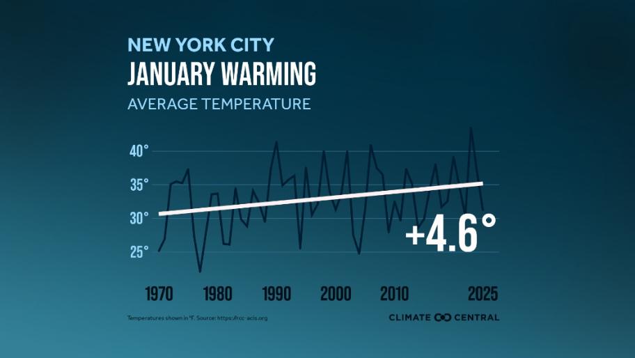
One case in point is the graph of average temperatures for January [January Warming] in New York City seen here in the graph from Climate Central. The solid white line starts at about 30 degrees in January 1970 and ends at about 35 degrees in January 2025. The darker up and down lines in the background of this graph are the year-to-year variations we normally see in weather data. But when this data is averaged over that period of time, we find there has been a 4.6 degree increase in the temperature over that 50-year period. This is now climate!
It is getting warmer!
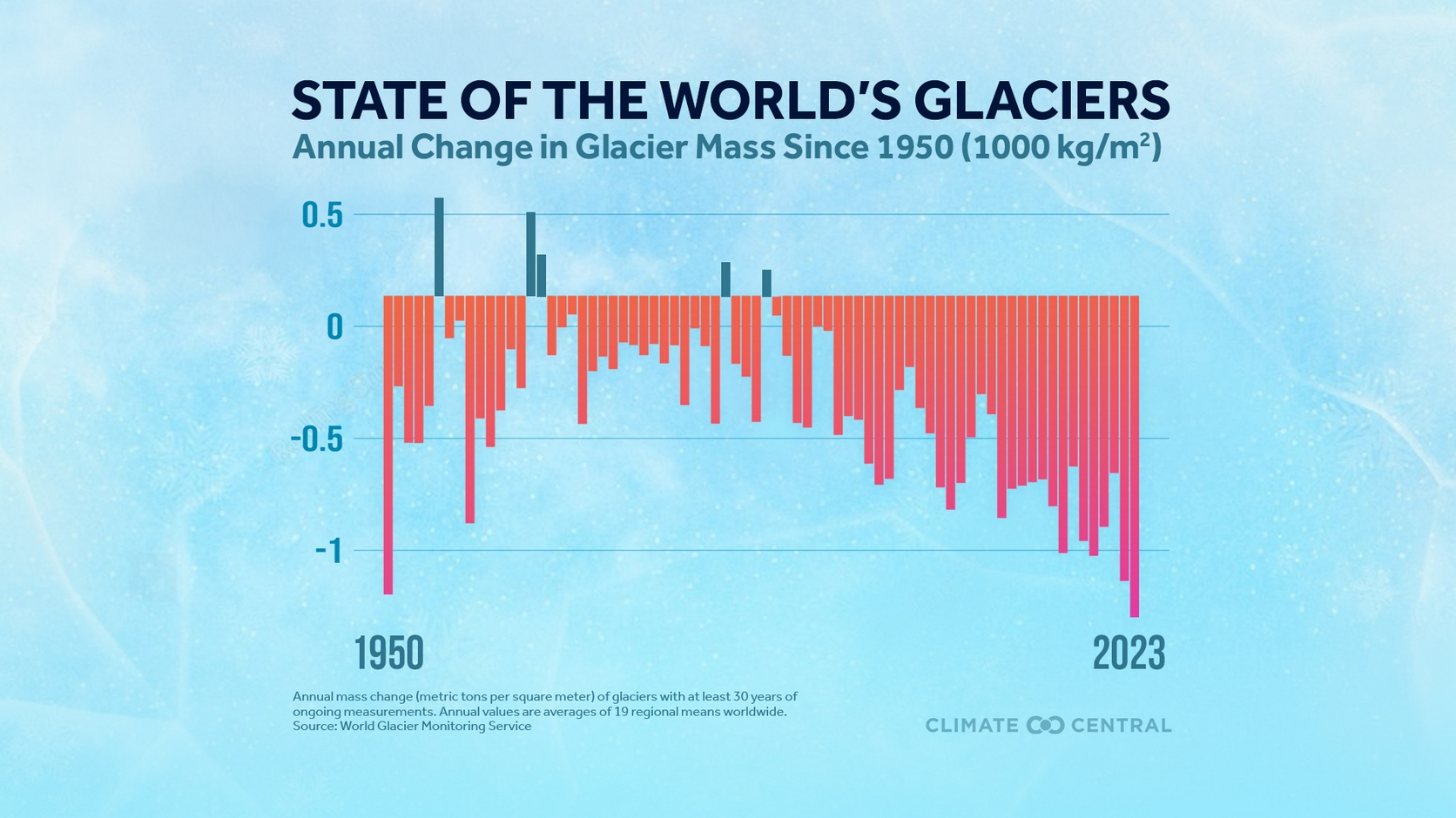
Another data set collection has to do with glacier volumes. We know they are melting. They are retreating up their valleys and shrinking, or melting from the topdown or thinning, as well. They are losing volume and hence mass and some of the sea level rise that is occurring is a direct result of this melting.
So, this melting has attracted glaciologists and scientists around the world that study this physical attribute, and they take measurements annually of all thing’s glacier. So, let’s look at a bar chart titled “State of The World’s Glaciers.” This bar chart was also supplied by Climate Central and covers the years from 1950 to 2023. One vertical “bar’ represents one year.
All the annual measurements are plotted here relative to a baseline number of about 0.1 as a reference. The bars above this baseline show mass gain: those bars below the baseline show mass loss. These data are averages of nineteen regional means globally. Only in five of the past 73 years did the mass of glaciers increase [note the bars that rise above 0.1 baseline]: in all of the other 68 years the glacier ice mass decreased. Also, based on the increased downward trend in the later years in this chart, glacial ice loss is accelerating.
The units in the bar chart are interesting in that they are in metric tons [1000kg/square meter]. This is a parameter, or calculation, which allows the data to be presented in a consistent manner and illustrates a huge amount of ice loss.
And, since it is winter, well, let us talk about another ice parameter, its’ age.
The age of floating sea ice is an important ice measurement that highlights the warming of our planet. This applies to the North Polar Sea ice. Note the graph titled, “Age of Arctic Sea Ice” also from Climate Central, with five varyingly shaded, jagged lines going from left to right. This data was developed from satellite instruments which became available in the early 1980’s. The graph covers a 35-year period starting in 1985.
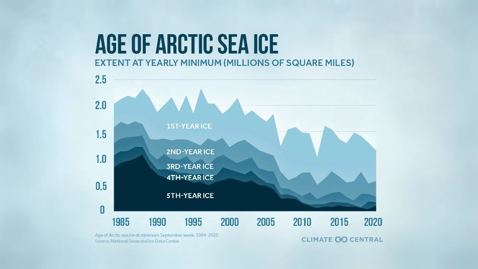
The ice that forms on our lakes and ponds in the North Country is annual, or first year ice. It forms in Winter and then melts completely in Spring. It does not hang around for another year. In the Arctic however, some ice formed in one year will last into future years. These are labeled as 2nd, 3rd, 4th, 5th year ice.
As our climate warms more and more of the Arctic Sea ice melts each year leaving less of the “old” ice. This is clearly shown in the graph. The 5 th year ice starts at an elevated level on the left in1985 and then steadily decreases as we move to 2020 where it is almost non-existent. The same is true for 2 nd, 3rd and 4th year ice as well.
They all decrease as we move towards 2020.
Note: The units here are in millions of square miles: we are talking here about a lot less ice.
This is a clear example of the warming that is occurring in the Arctic, right now. The “old” ice is almost all gone leaving just the newer younger ice formed in the last two to three years.
Since we are talking about “ice” there is one more chart that is of interest. The title is “Arctic Sea Ice Extent.” This information is from the National Snow and Ice Data Center [NSIDC], at the University of Colorado Boulder. This is another powerful data set that illustrates the warming of our planet.
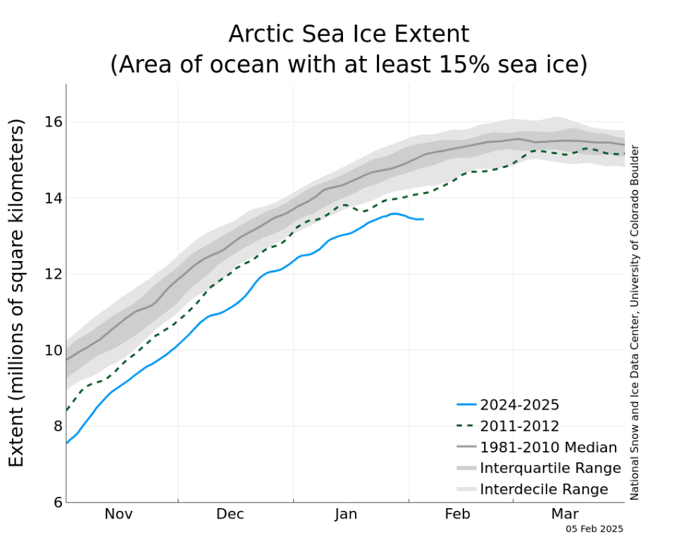
The left-hand vertical axis of this graph is in millions of square kilometers [of ice] with the lowest solid blue line starting at about 7.5 million square kilometers. The bottom axis is in months of the year. It starts at the beginning of November when sea ice is forming after the 24 hours of daylight season ends and the polar night begins. All the lines and shaded areas from previous years continue to rise as the Fall and Winter seasons progress until they reach a maximum in March as Spring begins.
Of particular interest is the lowest solid line in blue, which is far, far below all of the past 45 years of satellite measurements. And, that is this year’s ice! Is our planet warming?
The answer is YES.
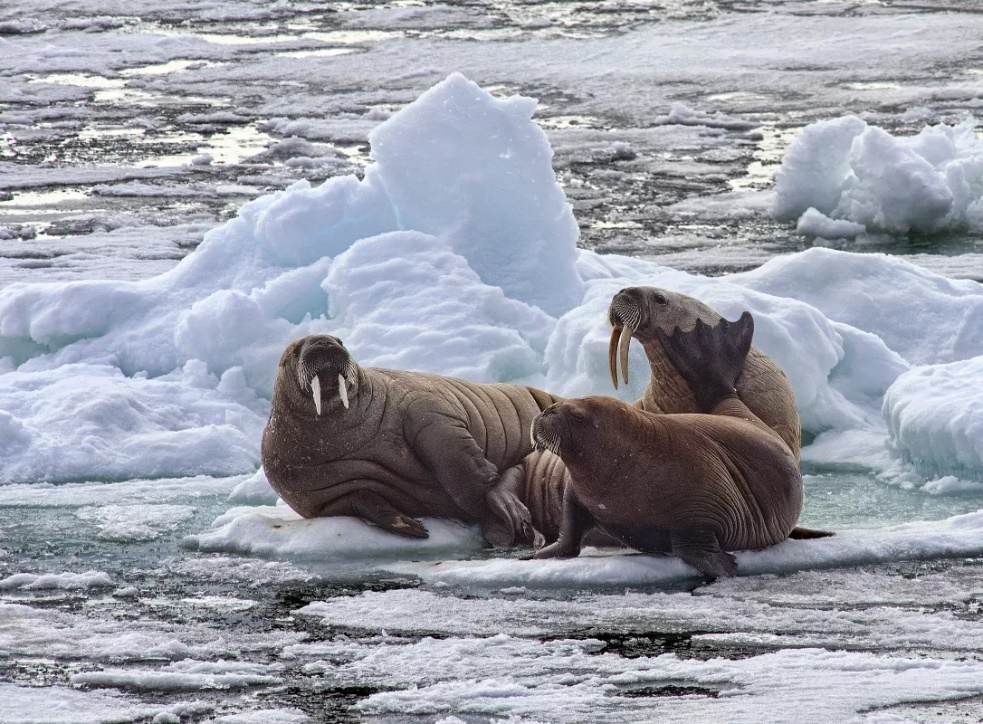
See photo of three walruses on an ice floe in the Arctic courtesy of NSIDC.
For those interested in this hot topic several books may be of interest:
- “When the Ice Is Gone” by Paul Bierman.
- “The Ice at The End of The World” by Jon Gertner.
- “The End of Ice” by Dahr Jamal.
And, so it goes.
The scientific career of Raymond N. Johnson, Ph.D., spanned 30 years in research and development as an organic/analytical chemist. He is currently founder and director of the Institute of Climate Studies USA (www.ICSUSA.org). Climate Science is published monthly.